Blog New Logo
I always enjoy the icon designs in just black and white. Leaving the shapes to deliver the idea.
I do think a nice logo design, a compact icon, can deliver the essence spirit of a product, a brand, or a company.
A picture is worth a thousand words.
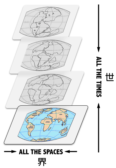
World. In Chinese it is written as 世界(wiki), which origins from Sanskrit(梵语, wiki). The position of Sanskrit in India, is as Latin and Ancient Greek in Europe.
The two characters serve the word as two hemispheres. 世 means all the times (in the past and future), and 界 means all the spaces.
![]()
I polished the shape of the first horizontal stroke of the character 世 to create two sharp triangles in the character. The character is placed in an unstable way, it will eventually roll over to left, and the triangles will keep it more stable by sticking into the ground.
When designing the logo, I find there lies a culture difference. Thinking about 世界(world) and 宇宙(universe), in both eastern words, the first character stands for all the times and the latter for all the spaces.
In contrast, the word world in English refers to the earth and all the people, places, and things on it (Cambridge Dictionary), and universe stands for everything that exists, especially all physical matter, including all the stars, planets, galaxies, etc. in space (Cambridge Dict.). The concept of time is somehow missing.
Maybe eastern philosophers suffer more anxiety from taking time as an additional cage.